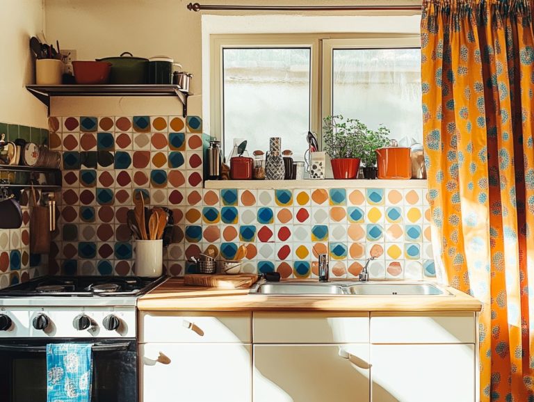
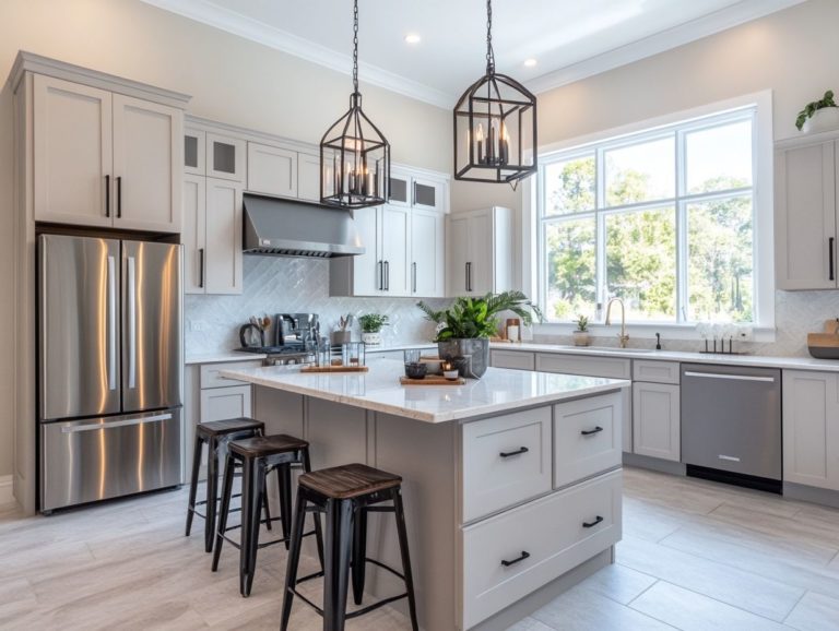
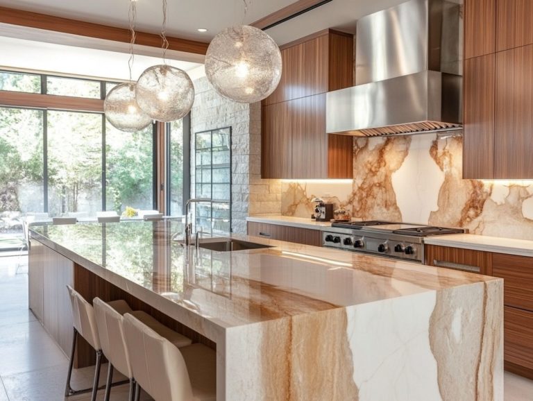
Using Color Blocking in Kitchen Design
Color blocking goes beyond just being a trend; it’s a transformative technique that can elevate your kitchen into a visually stunning and cohesive space.
This approach enhances visual appeal and creates harmonious looks that make your cooking area shine. You’ll love discovering how to choose the perfect colors, implement them effectively, and avoid common pitfalls along the way.
You’ll also learn how to adapt color blocking to fit various kitchen styles, ensuring your space reflects your unique taste. Dive in and get inspired to revamp your kitchen with this dynamic design approach!
Contents
- Key Takeaways:
- Benefits of Using Color Blocking in Kitchen Design
- Choosing Colors for Color Blocking
- Implementing Color Blocking in Kitchen Design
- Mistakes to Avoid When Using Color Blocking
- Incorporating Color Blocking in Different Kitchen Styles
- Frequently Asked Questions
- What is color blocking in kitchen design?
- Why should I use color blocking in my kitchen design?
- What are some popular color combinations for color blocking in kitchen design?
- How can I incorporate color blocking into my kitchen design?
- Are there any tips for using color blocking in a small kitchen?
- How can I ensure a cohesive look when using color blocking in my kitchen design?
Key Takeaways:
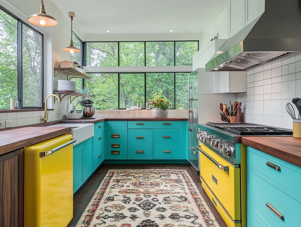
Color blocking in kitchen design adds visual interest and appeal, making the space more vibrant and unique. When choosing colors for color blocking, consider color theory, which is the study of how colors work together, to create a unified look. To successfully incorporate color blocking into your kitchen, avoid clashing colors and overwhelming the space with too many bold hues.
What is Color Blocking?
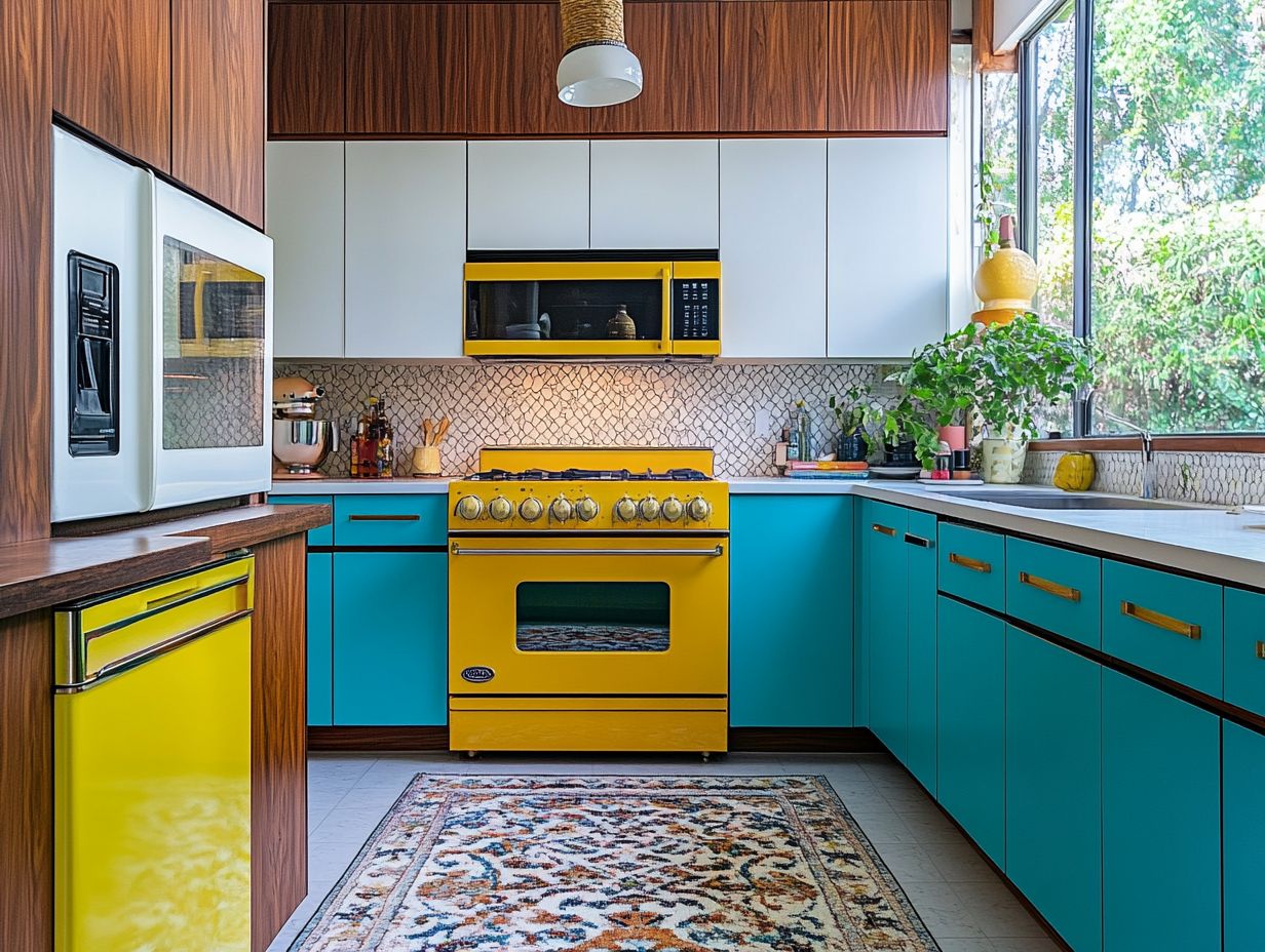
Color blocking is an innovative interior design technique that uses bold and vibrant colors to create striking contrasts within your space, enhancing both visual appeal and emotional connection.
By applying color combinations from the color wheel strategically, you can achieve a harmonious balance. This method has gained popularity in contemporary architecture studios like Plutarco, where design intertwines seamlessly with creative expression.
Originating from early 20th-century art movements, color blocking has evolved into a prominent trend that captures attention and stirs emotions.
Incorporating warmer tones like fiery reds and sunny yellows infuses energy, making them perfect for social areas like living rooms and kitchens.
Conversely, cooler shades such as tranquil blues and serene greens promote relaxation, making them ideal for spaces like bathrooms. Its adaptability allows color blocking to beautify modern kitchens with lively contrasts and enrich bathrooms, creating a balanced ambiance that resonates emotionally with you and your guests.
Benefits of Using Color Blocking in Kitchen Design
Utilizing color blocking in your kitchen design brings numerous benefits, enhancing visual appeal while crafting a unified look.
This approach enables you to express your unique style through vibrant hues and emotionally resonant colors, each evoking feelings that transform the space into a true reflection of your personality.
Enhancing Visual Appeal
Enhancing your home’s visual appeal through color blocking focuses on integrating energetic colors and a vibrant palette that allows for artistic expression. This approach captivates the eye and reflects your personality in every corner.
Imagine transforming dull areas into striking focal points with bold choices. For instance, picture your living room adorned with a daring combination of teal and mustard yellow, where a statement wall immediately draws attention, beautifully complemented by furniture in contrasting shades.
In the kitchen, pairing rich navy with crisp white evokes a fresh, sophisticated ambiance.
These daring color combinations often draw inspiration from artistic trends like minimalism or bohemian styles, encouraging you to experiment with unexpected pairings that express your unique tastes and create a harmonious flow throughout your home.
Creating a Cohesive Look
You can create a cohesive look in your modern kitchen with color blocking by thoughtfully pairing contrasting cabinets and selecting color combinations that align with current trends, achieving a dynamic aesthetic.
By incorporating shades that complement each other while making bold statements, you can elevate the overall vibe of the space.
For example, pairing deep navy with crisp white imparts a classic yet contemporary feel, while vibrant yellows and muted grays infuse energy into the environment.
Selecting the right materials—whether matte or glossy finishes—further enhances this striking visual impact. By integrating accessories and textures that echo your dominant color palette, you can tie the entire design together, resulting in a stylish and inviting kitchen.
Now that you know the benefits and techniques of color blocking, why not try it in your own kitchen? Share your results and inspire others!
Choosing Colors for Color Blocking
Choosing colors for color blocking can be exciting! It involves understanding basic color theory to create stunning visual effects.
This knowledge lets you create a lively palette that blends well with nature.
Color Theory and Combinations
Color theory helps you mix warm and cool tones effectively. This balance can change the mood of a space significantly.
Think about how different colors make you feel. For instance, blue and green create a calm atmosphere, great for wellness areas.
On the other hand, red and yellow can energize a cafe or social spot!
Pale pastel colors can evoke calm and nostalgia, perfect for baby nurseries or vintage rooms.
By applying these combinations thoughtfully, you enhance beauty and influence how people behave in different spaces.
Implementing Color Blocking in Kitchen Design
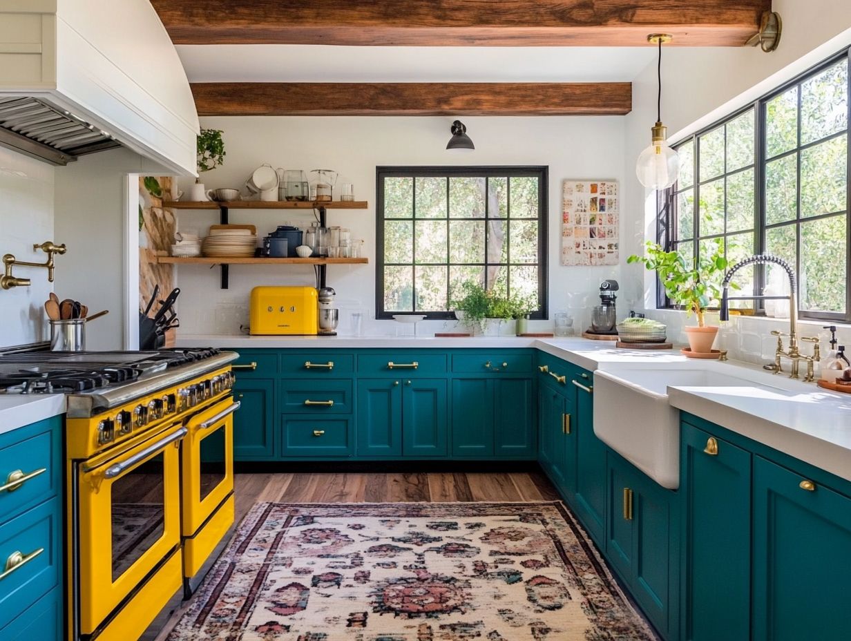
Bright colors can elevate your kitchen design! Use vibrant hues on walls and cabinets to create an exciting atmosphere.
Pair these colors with well-chosen accessories that boost both style and functionality.
Walls and Cabinets
When focusing on walls and cabinets, bright colors are key. They make bold statements that refresh your culinary space.
Think about the brightness and contrast of your colors. Soft pastels with bright shades can create harmony and highlight features like cabinetry.
Using complementary colors adds visual interest, making your kitchen inviting and energetic. Balance these choices to showcase your unique style.
Accessories and Accents
Accessories are essential for bringing color-blocked kitchens to life. Choose items that unify your design and add creative flair.
Select vibrant dishware, stylish containers, and eye-catching textiles. For example, pairing bright yellow plates with deep blue utensils creates a fun contrast!
Consider adding a bold table runner or colorful bar stools that match your color palette. These touches make your kitchen joyful and inviting.
Mistakes to Avoid When Using Color Blocking
When embracing color blocking, avoid common mistakes like clashing colors. Such errors can ruin your design’s harmony.
Focus on balance and smart color choices to enhance beauty and create a cohesive space.
Clashing Colors
Clashing colors can lead to significant design errors in color blocking, disrupting visual harmony. This ultimately detracts from the intended emotional impact of your space.
To cultivate a cohesive aesthetic, it’s essential to grasp the fundamentals of color theory. While complementary colors create vibrant contrasts when used sparingly, overwhelming a space with too many jarring hues can feel chaotic instead of inviting.
Successful designers often choose a dominant color and enhance it with one or two accent shades. This approach enables the eye to flow naturally. Incorporating a well-placed neutral tone can bridge the gaps between bold colors, softening the overall effect while maintaining visual interest.
By being mindful of these strategies, you can sidestep the pitfalls of clashing colors. Achieve a harmonious design that resonates positively with your viewers.
Overwhelming the Space
Overwhelming a space with an excess of bold colors in a color-blocked design creates visual chaos. Incorporating serene tones is crucial for achieving design balance.
Thoughtfully introducing softer hues creates a harmonious contrast that allows the eye to rest. This enhances the overall appeal of the space.
This deliberate integration not only elevates the vibrancy of bold colors but also allows them to pop without overwhelming your senses. Incorporating shades like soft greys, muted pastels, or earthy neutrals will soften the visual impact.
This balanced approach fosters a calming atmosphere, ensuring that the energetic interplay of bold tones complements the space beautifully rather than dominating it.
Incorporating Color Blocking in Different Kitchen Styles
Incorporating color blocking across various kitchen styles—from sleek modern designs to charming traditional and rustic aesthetics—lets you unleash your creativity. It enhances each style with carefully curated color combinations that resonate with character and individuality.
Modern and Minimalistic
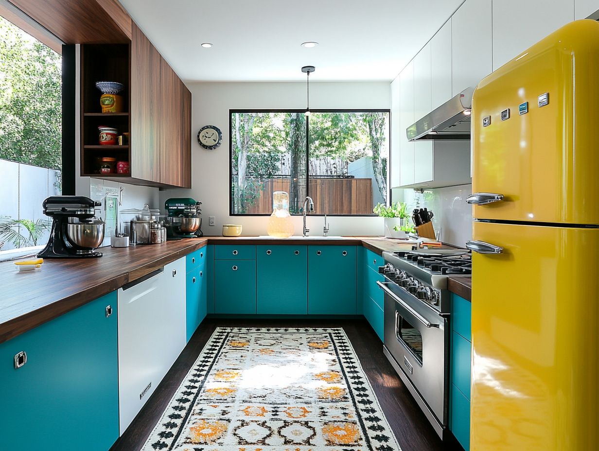
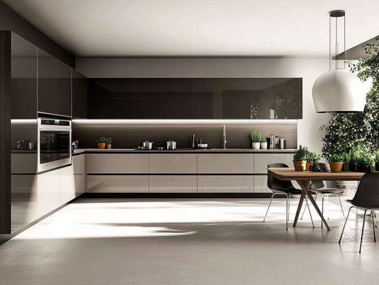
In modern and minimalistic kitchens, you can elegantly apply color blocking through sleek designs that utilize a palette of neutral tones. These tones can be accentuated by vibrant colors to create a sophisticated yet inviting atmosphere.
Thoughtfully choosing where to introduce bold hues harmonizes the overall aesthetic while keeping things clean and uncluttered. For instance, think about a striking backsplash or well-placed cabinetry in a rich color that contrasts beautifully with surrounding whites or grays.
Incorporating colorful kitchen accessories, such as vibrant dishes or stand mixers, serves as delightful focal points without overwhelming the space. This careful balance enhances visual appeal and allows for personal expression, transforming a functional area into a lively and modern culinary oasis.
Traditional and Rustic
In traditional and rustic kitchens, color blocking can evoke warmth and comfort. Use rich hues that reflect heritage aesthetics while seamlessly integrating contemporary design trends.
By thoughtfully selecting color palettes inspired by nature and vintage elements, you can achieve a harmonious balance between the old and the new.
For instance, pair earthy tones like olive greens or deep reds with soft whites or muted grays to enhance the cozy atmosphere of your rustic space.
Strategically placing bold colors on feature walls or cabinetry creates a captivating focal point that draws the eye. This introduces a refreshing twist to warm undertones.
These techniques honor the rich history of traditional design while inviting vibrant energy into your kitchen.
Frequently Asked Questions
What is color blocking in kitchen design?
Color blocking in kitchen design is using blocks of different colors to create a stylish look. It involves strategically using color to create a visually appealing and cohesive design.
Why should I use color blocking in my kitchen design?
Color blocking instantly adds depth and character to your kitchen! It helps create a sense of organization and functionality in the space. It’s a popular trend in interior design that can make your kitchen stand out.
What are some popular color combinations for color blocking in kitchen design?
Popular combinations include black and white, navy blue and gold, and shades of grey with pops of yellow or green. The best choice depends on your style and kitchen aesthetics.
How can I incorporate color blocking into my kitchen design?
You can paint walls in different colors or use colorful tiles and backsplashes. Consider colorful appliances or contrasting colors for cabinets and countertops!
Are there any tips for using color blocking in a small kitchen?
In small kitchens, use color blocking carefully. Stick to a limited color palette to avoid overwhelming the space.
Lighter colors can create an illusion of a larger area, making your kitchen feel more open.
How can I ensure a cohesive look when using color blocking in my kitchen design?
Choose colors that complement each other to create a cohesive look. Incorporating similar colors in other areas of your home can help tie the design together.
